Graphic Elements
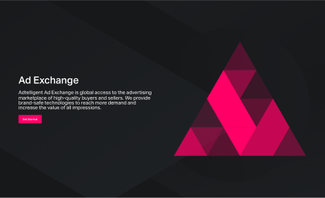
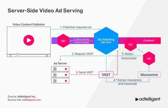
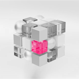
In our visual communication, we use simple geometric shapes with sharp edges, such as a square, pentagon, triangle, and straight lines intersecting at a certain angle. These shapes can have both brand color fills and strokes. In addition, we also use a low-poly technique to serve these objects and a little “Flat” 3d with isometrics in cases where we need to point to our specific product.
Here you can see how we use it.
Here are Some Examples





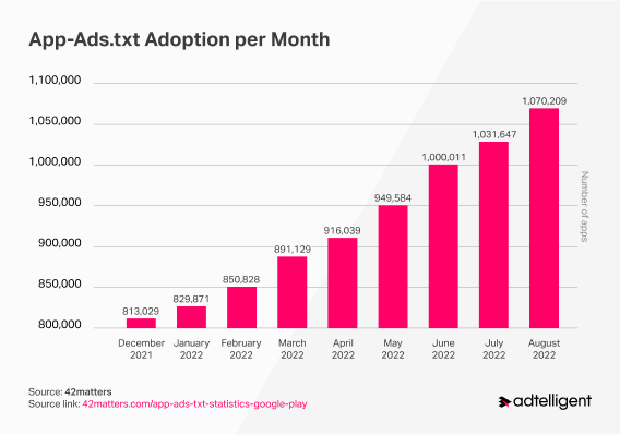
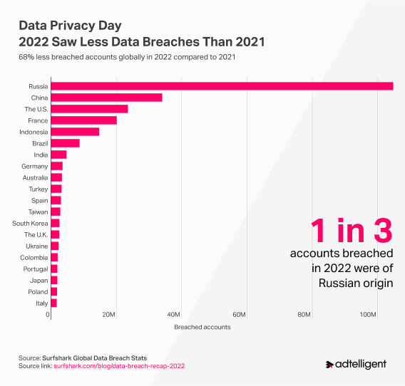
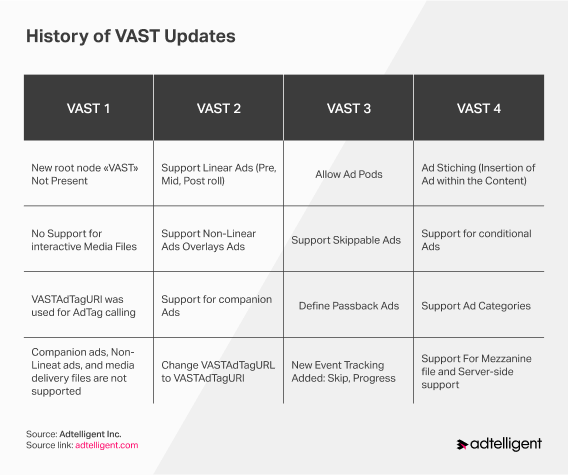
How We Work with Charts and Statistics
Tagline

Our tagline, “Making Digital Monetization Simple”, reminds us of our commitment to providing our clients with the technology and support needed to make the adtech industry more transparent and independent using innovative advertising technologies.
Do’s
- All fonts are used correctly, and the hierarchy in the text is consistent and prominent.
- Elements such as hexagons, lines, and oblique backgrounds are used here. This is the correct application of our graphic elements.
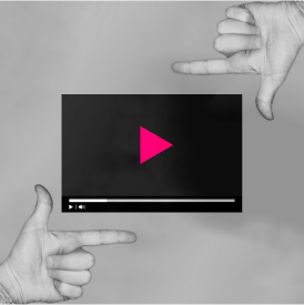
- We are happy to use photos in our work. However, remember to bleach them or tint them with our accent colors.
Dont’s


- We try to avoid rounded corners and round elements in our visual communication.
- Try to avoid too many colors. Remember the 70/30 rule. Accent color to emphasize something significant.
- Use clear stock illustrations. In our communication, we try to be minimalistic and abstract.
- Our designs mainly feature sharp geometric shapes. We advise against using streamlined lines and shapes.
Press Downloads
You are free to use the files provided here.
You can find information about how we distribute our materials in the Terms of Services and the Terms and
Conditions
If the files you need are unavailable, please contact us.
Let’s move forward
16192 Coastal HWY,
Lewes, Sussex, DE,
US 19958